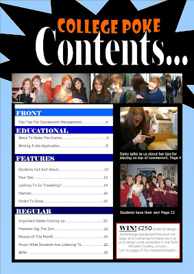
This first image is my second design for the contents page. I wanted to carry on the same colour scheme before so I chose the black spiked shape to border the orange font.
I also wanted a different coloured background for the list of articles, so that they were clearer to read. Therefore I chose white because this contrasts against the light blue.
When looking at different examples of magazine contents, I noticed how they included a variety of photos which were related to the articles. So I decided to use my own photos to break up the text and make it more visually pleasing.

This is my final design for my contents page. I thought that having the word 'Contents' in a bigger font was more important than the magazine name to make it more obvious what the page was.
Also I noticed that many magazines effectively broke up the text with blocks of colour, so I tried out dividing my contents list with subtitles.

Great final contents page - really like it!
ReplyDelete