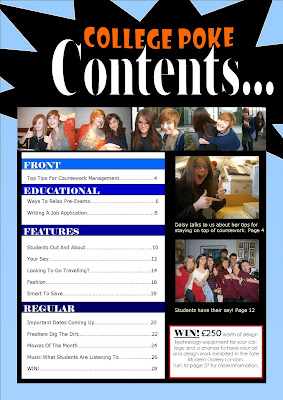
My student magazine contains many features which resemble magazines design for young people. On the front cover, it is important to include many photos to draw the reader in, also this gives them an idea of what to expect in the magazine. In my magazine I have used various photos of teenagers at college having a good time. This helps the reader to reflect on the magazine and tells them that they will enjoy reading it.
In general, student magazines normally have
coverlines with aspects that lure the reader in. However I chose not to include this in my own magazine; instead I put my lure in the banner that stretches across the page because this is the first thing the reader sees when they look at the magazine. Also I put in a
strapline however I moved it further down the page so that the white font stood out on the black background. My
strapline is similar to those in a student magazine because it gives the reader information about what's inside.
It is important to catch the reader's attention straight away. The colours need to be bold and colourful. If your magazine is aimed at females, the colours should be more
pastel and maybe tones of pink, purple and blue. On the other hand if the magazine is aimed at males then the colours are darker
possibly reds, blues and greens. For my student magazine, it is aimed at both genders so my colour scheme needs to appeal to both.
My student magazine doesn't specifically represent any social groups. It
represents teenagers who want to have fun whilst learning this is shown through photos of students laughing and smiling. None of the photos are negative in any way, for example of a student smoking. They show friendship and togetherness. The magazine includes articles which are both educational, informative and entertaining. The language I have used is informal because this represents how teenagers talk to their friends. For example in the regular section of the contents there is a page labeled "WIN!" suggesting that this has been shouted. I think the name of my magazine will draw in young readers because it is similar to
Facebook Poke which the majority of students use.
My magazine will be distributed by the college and funded by the college council.
My targeted audience is students at college aged between 16-18 who enjoy reading about the latest events and also interesting articles that are both educational and entertaining. The reader might also be someone who wants to support college funds by paying a small contribution for the magazine.
The colours I have decided on for my student magazine are orange, blue, red and black. These colours are effective colours because they stand out and would be eye catching amongst other magazines. Photos I have included illustrate college life outside the classroom. They show students having fun and enjoying college. This shows that the magazine will be full of interesting articles which will be enjoyable to read. I decided to include a variety of photos because from my feedback, this is what students liked best; therefore they will be attracted most to my magazine in comparison to others. On the cover I have also used language to attract the reader. For example the word "revealed" suggests the reader is about to be informed something secretive. They have to buy the magazine to find out what it is. In addition in the contents page I have used a rhetorical question, "looking to go traveling?" this makes the reader question themselves and it also tells them that the answer to this question is hidden within the magazine.
Software i have used to produce this magazine cover is Microsoft Publisher. This enabled me to create coloured text for my headline. Also border my photos and slant them to the side. This software enabled me to perform simple effects on my pictures and use basic shapes as a background image.


